


Your Instagram Stories ad needs to capture renters’ attention in seconds.
So what actually makes someone stop, watch, or click?
To find out, Conversion Logix graphic designer Sophia Coser analyzed Instagram Stories video ads created for multifamily communities and compared the creative patterns of higher- and lower-performing ads.
While creative performance is influenced by more than design alone, the analysis revealed several patterns in how imagery, copy, branding, pacing, and transitions can influence engagement.
Here’s what apartment marketers can learn from the ads that performed best.
What Our Top-Performing Stories Ads Did Differently
The strongest creatives had CTRs ranging from 4.47% to 6.54%. These are some of the patterns we uncovered among the most engaging ads.
Offers appeared within the first second
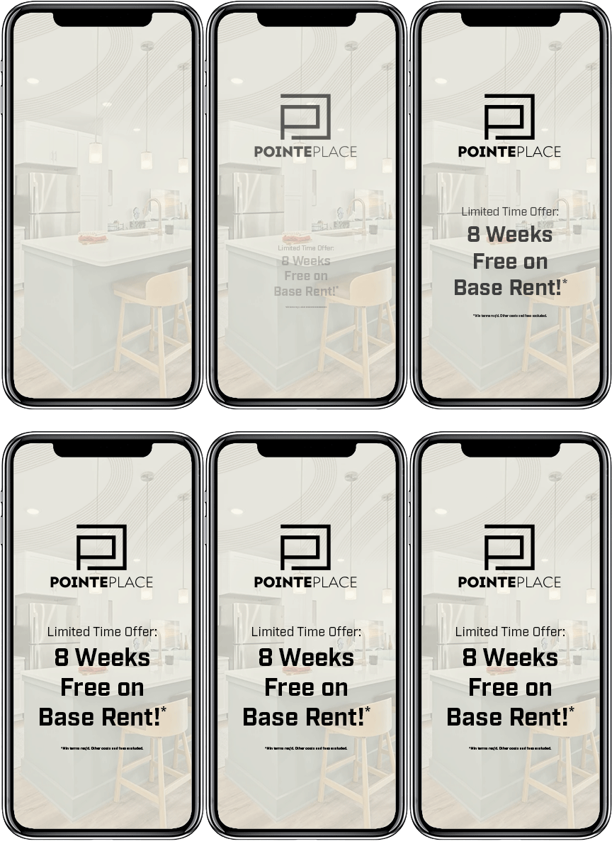
The messaging you lead with in a format like Instagram Stories is critical to capturing and keeping renters’ attention long enough for them to click your ad to visit your site.
The top performers with concessions that displayed the offer on screen earlier in the video saw stronger results compared to properties that introduced it later in the video. Our best-performing creatives presented the offer within the first second.
The highest click-through rate in the analysis was 6.54% for an ad that displayed its concession within the first second using large, bold typography. Another top performer, with a 4.92% click-through rate, also introduced its offer immediately and kept it visible throughout the video.
By comparison, one of the lower-performing creatives delayed its concession and paired that slower reveal with smaller typography and slower transitions. Its click-through rate was 0.99%.
Not that every Stories ad needs a concession, but it does help to lead with messaging that either communicates a unique and compelling offering or something limited-time, encouraging renters to act now vs. later. That could be a meaningful rent special, a compelling starting rate, newly renovated apartments, a distinctive amenity, or a strong location benefit.
The main takeaway is to convey why someone should care about your ad within the first few seconds so they don’t tap through to the next video.
Bright interior shots filled the frame
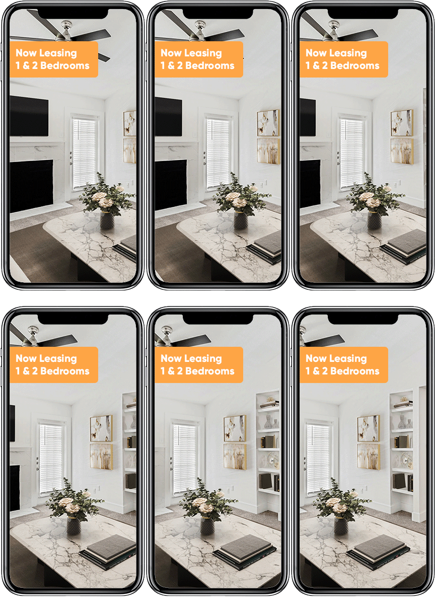
One of the most consistent differences between stronger and weaker creatives was how prominently the property units appeared within the frame.
The higher-performing ads tended to use high-quality imagery that filled a large portion of the screen. Bright, modern interiors were particularly effective at creating immediate visual interest. One top-performing ad, for example, led with a living room featuring a city view and generated a 4.68% click-through rate and a longer average watch time.
By contrast, some of the lower-performing ads opened with darker imagery, exterior shots, tightly cropped appliances, or layouts where the property photography occupied less of the available screen.
One of the benefits of advertising apartments is that apartments themselves are visual products. A bright living room, dramatic kitchen, rooftop view, resort-style pool, or another defining feature can convey more about the property’s experience in one second than several lines of copy can.
To get better results in your next ad, make sure the photography you use takes advantage of natural light, highlights views from inside the units, and includes visuals of the actual living spaces rather than focusing solely on exterior and lifestyle shots.
Selective copy styled with bold typography, high contrast, and visual hierarchy
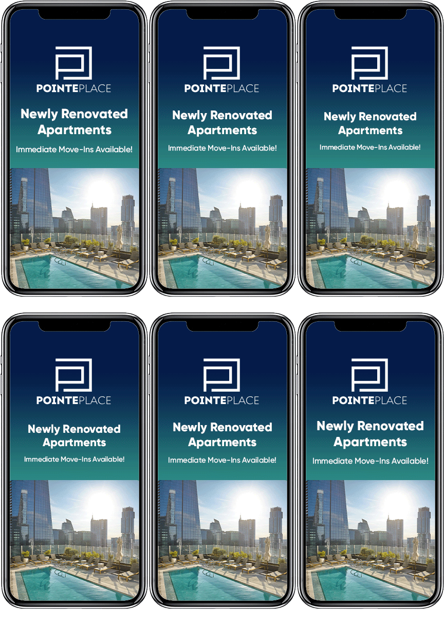
More information does not necessarily make an ad more persuasive.
Among the strongest creatives, typography tended to be larger, placed against high-contrast images and background colors, and organized with a clear hierarchy. This meant the message could be understood quickly without requiring the viewer to work through several competing pieces of information.
Several lower-performing examples had more on-screen copy, smaller text, or design elements competing for attention. In one example, the logo occupied a large portion of the screen while the concession remained comparatively small. Background textures and additional text further reduced clarity.
For marketers, the question should not be, “How much information can we fit into this ad?”
It should be, “What is the one thing someone needs to understand before they swipe away?”
We found the following content order to deliver the best results in fast-paced ad mediums:
Primary message → supporting detail → brand
If you find yourself overwhelming your ads with copy, remember that some information is better left for the landing page than squeezed into a short-form video. The goal of Instagram Stories ads is to ignite interest in your property. Rather than list all of the reasons a renter should choose you, lead with the most compelling and let your website do the heavy lifting after you’ve captured their attention.
Fast pacing that matches the platform
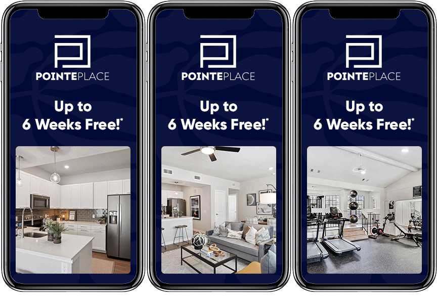
Higher-performing ads also tended to feel faster.
Quick, clean transitions and upbeat pacing appeared repeatedly among the strongest creative examples. Top performers combined engaging property imagery with quick text transitions, but were selective about the number of frames and how long they appeared, so the creative did not feel overwhelming.
Lower-performing ads more frequently used slower transitions and calmer pacing, delaying both new imagery and new information.
That does not mean every apartment ad should become a rapid-fire montage. Readability still matters. The goal is to maintain enough movement to continually give the viewer a reason to keep watching.
A good rule of thumb is to ask yourself, “Does something visually meaningful happen within the first few seconds?” If not, the ad may be asking too much patience from someone tapping through Stories.
What should apartment marketers take away?
Designing an apartment ad for Instagram Stories is not simply about shrinking a traditional apartment ad into a vertical format.
It is about designing around how quickly people consume the format.
The strongest Instagram Stories ads in our analysis communicated value quickly, featured appealing property imagery, used readable typography, minimized competing information, and maintained enough motion to keep the creative moving.
The more quickly a renter can understand what makes your apartment community worth noticing, the better chance your creative has of turning a few seconds of attention into meaningful engagement.
How to Apply This to Your Next Campaign
The next time you are designing video creative on Instagram Stories for an apartment using photo assets, try the following:
- Put your concession on screen in the first second, in font formats you can read from arm’s length.
- Test larger concession typography and a stronger visual hierarchy of copy.
- Lead with a bright, high-quality interior shot that fills the frame.
- Cut copy that competes with the core message.
- Use faster pacing and quicker transitions while maintaining readability.
Want more tips like these? Get findings like these in your inbox.
Subscribe to the CLX newsletter to find out what’s changing in multifamily digital marketing and what we’re learning from our campaigns.
