Ways to Make Your Apartment Website More User-Friendly
- 22 August 2018

Entering a poorly designed website is like searching for a light switch in a dark room, you know what you are looking for, but you can’t quite seem to get there. If a prospect comes across your website and can’t find what they’re looking for, there is a good chance they may leave and never come back. Don’t lose leads to a bad user experience. Use these tips to make your website more user-friendly and increase the likelihood that prospects will make it to the next stage of the leasing funnel.
Improve Load Times
According to Google, as page load times go from 1 to 5 seconds, the probability that the user will bounce (exit the page immediately) increases by 90%. Do you need a simple way to improve your page speeds? Google also found that 30% of websites can greatly improve their site speed just by compressing images and text.
You can use Google’s Page Speeds Insights tool to find out how your website load times compare and receive detailed feedback on how you can optimize your site for speed.

Use Visible and Intuitive Call to Actions
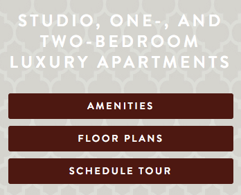
Making sure your call to actions are visible and clear, can have a big impact on a user’s experience. If your main goal is to get someone to lease an apartment you want to make the “lease now” or “apply now” call to actions easy to find and directs the prospect right to the application portal. The last thing you want is for someone to get frustrated and give up while trying to apply for a lease. Other call to actions you should make more visible on the homepage are “schedule a tour”, your phone number, and “contact us”.

Make it Mobile Friendly
Websites in 2018 have to be mobile friendly. A majority of website visitors now view websites on mobile. If your website isn’t at least mobile responsive, Google will penalize you in both organic and paid search rankings. But beyond basic mobile responsiveness, many apartment websites can stand to improve their mobile site experience.
If a mobile phone user navigates to your site and wants to call you, they will expect to be able to click to call. If you don’t have click to call features enabled on mobile, or if it is difficult to find your community’s phone number or call button, you will lose out on leads.
Most mobile website menus are hidden behind the “three line” menu button. While most users know to click this to see your site navigation, it is much more intuitive for users to scroll through a homepage of a site first before navigating to a menu button. Given this, you can improve a website visitor’s experience by providing buttons and call to actions on the homepage that link to the pages you know prospects are most likely to visit.

Limit your Contact Form Fields
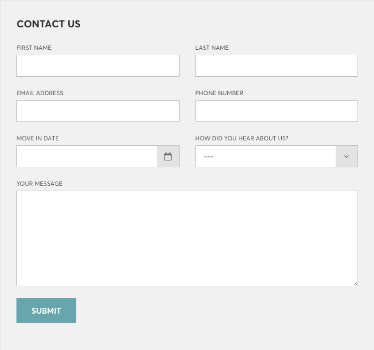
If a prospect is faced with a really long contact form, with many required fields, there is a good chance they won’t fill it out. Studies have shown that for the most part there is a negative correlation between the number of fields in a contact form and the form’s conversion rate. Limit your contact form fields to increase the chances that prospects will fill out your forms.

Use Live Chat
One way to make it simple and interactive for prospects to get information about your community is with live chat. Some site visitors may not want to take the time to browse your site to find the answers they are looking for. Not everyone likes filling out forms or making phone calls. Live chat provides these users with an alternative way to connect with your community. With live chat, prospects receive immediate feedback from real people who can help direct them to the next stage of the leasing process.

